
UX Harmonization
Problem
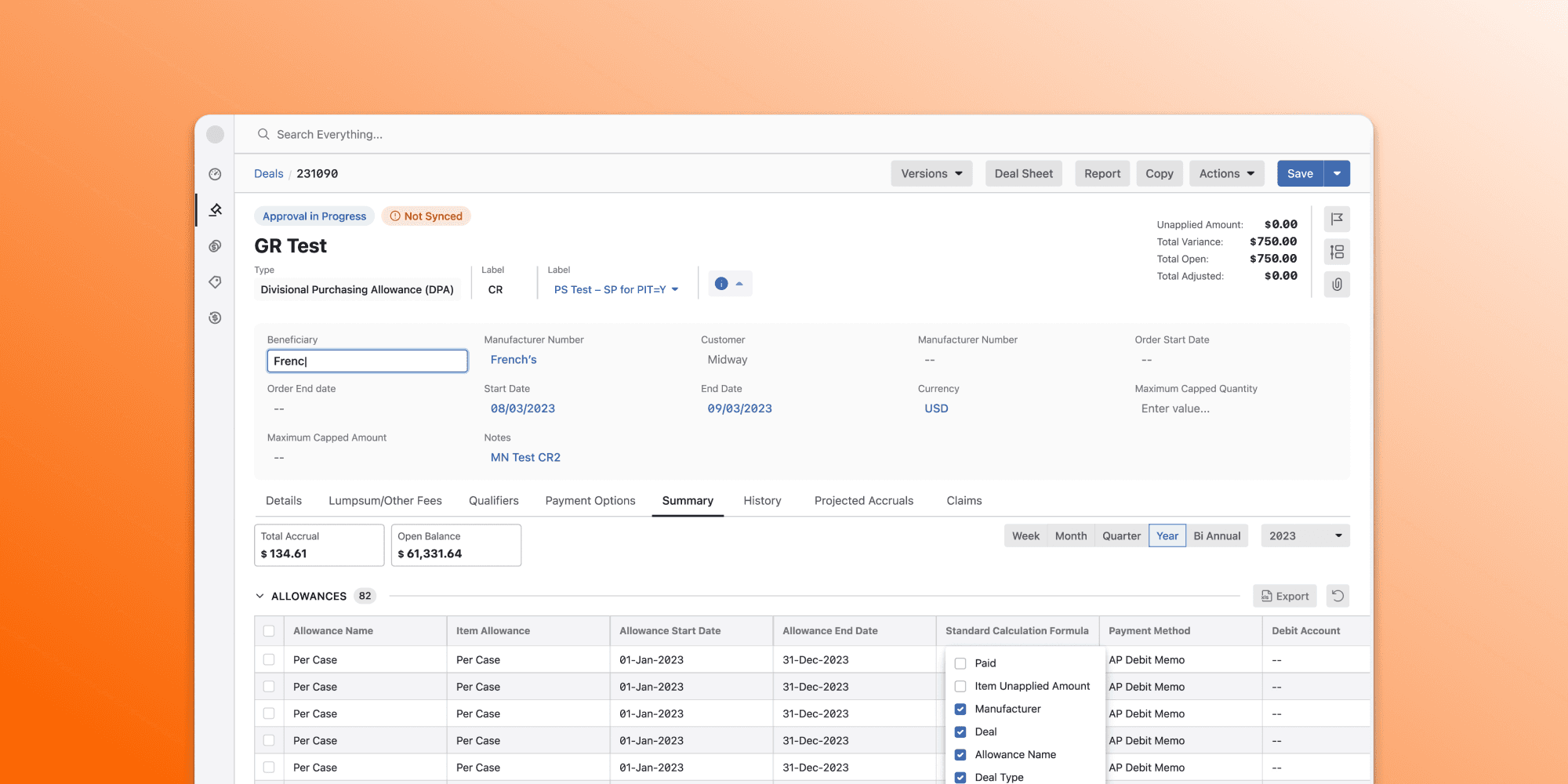
After multiple acquisitions, our suite felt disjointed to customers and prospects, who described it as a “Frankenstein experience,” and Sales had to choreograph demos across browser tabs to simulate a cohesive platform. The inconsistency was amplified because most customers used more than one application, and the products also sat on different front-end stacks.
Objective
Create a unified, harmonized user experience across all products to: - Establish a platform-level visual and interaction identity - Reduce friction during sales and customer onboarding - Drive internal alignment across UX, PM, and Engineering
Strategy
Align the Organization
Shared initiative broadly during New Employee onboarding (Functional Orientations) and company-wide meetings
Developed decks and messaging using car brand metaphors to communicate the importance of consistent, yet contextual, UX (e.g. Toyota Camry vs. Toyota Sienna vs BMW vs BYD)
Built momentum through empathy-driven storytelling and stakeholder buy-in
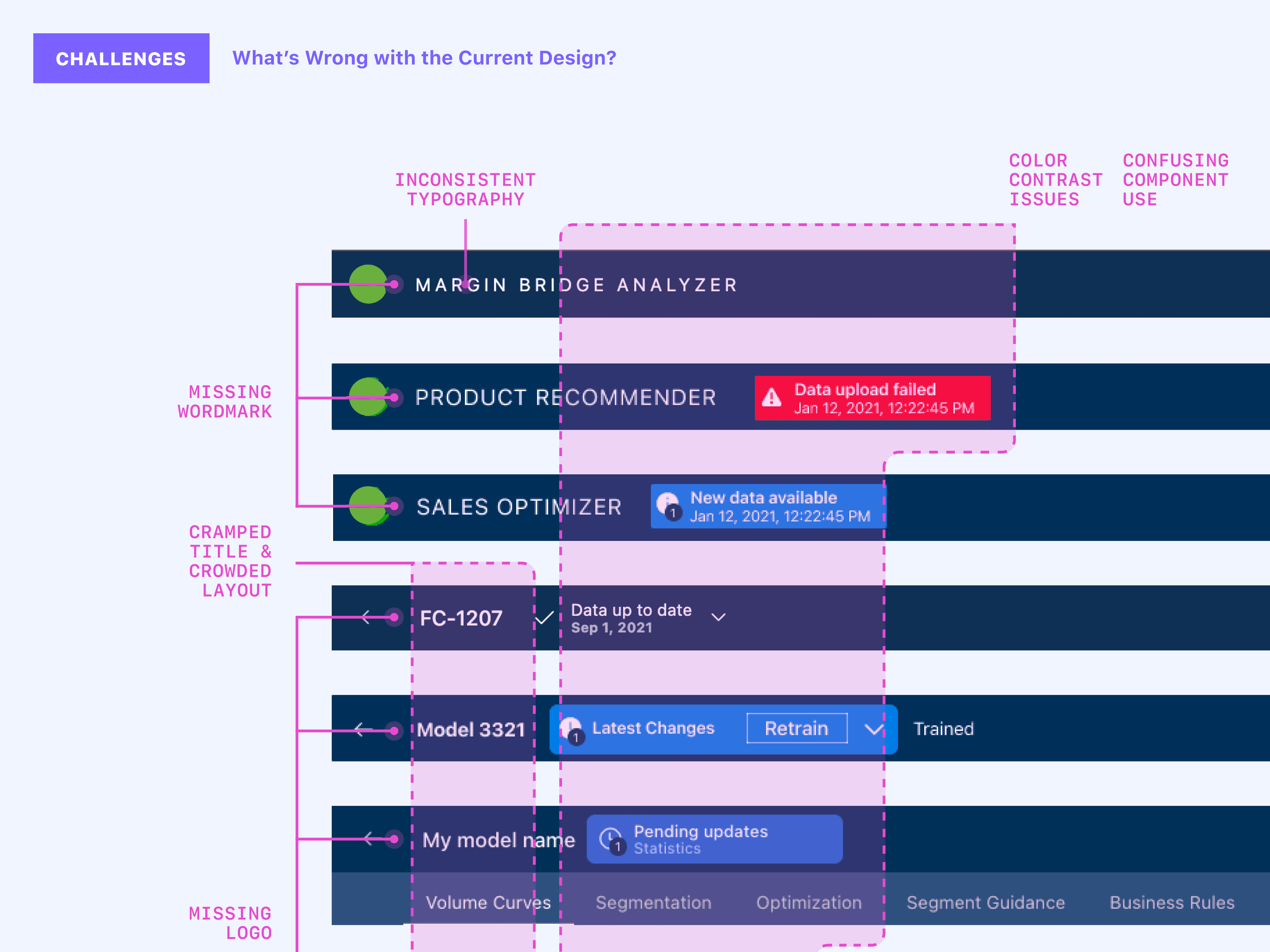
UX Audit + Best-of Selection
Used Pendo analytics to prioritize high-impact screens
Audited each product to identify best-in-class patterns, even if minor (e.g., filters, notifications)
Highlighted these wins in shared artifacts so all teams saw themselves in the new vision
Prototyping & Feedback Loops
Created hero-task prototypes across modules
Gathered feedback from SMEs (business consultants, training) and real users
Repeated iterative feedback loops until designs reached alignment and clarity
Implementation
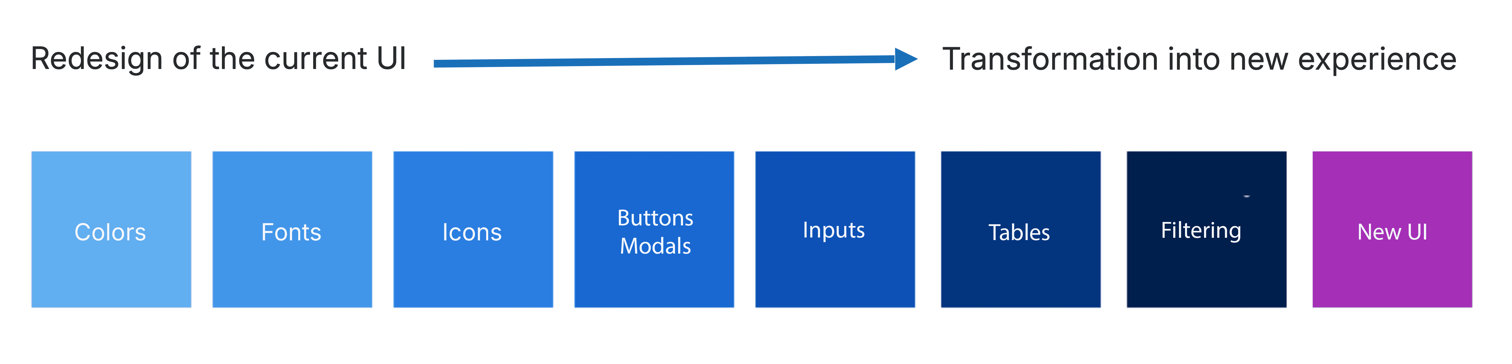
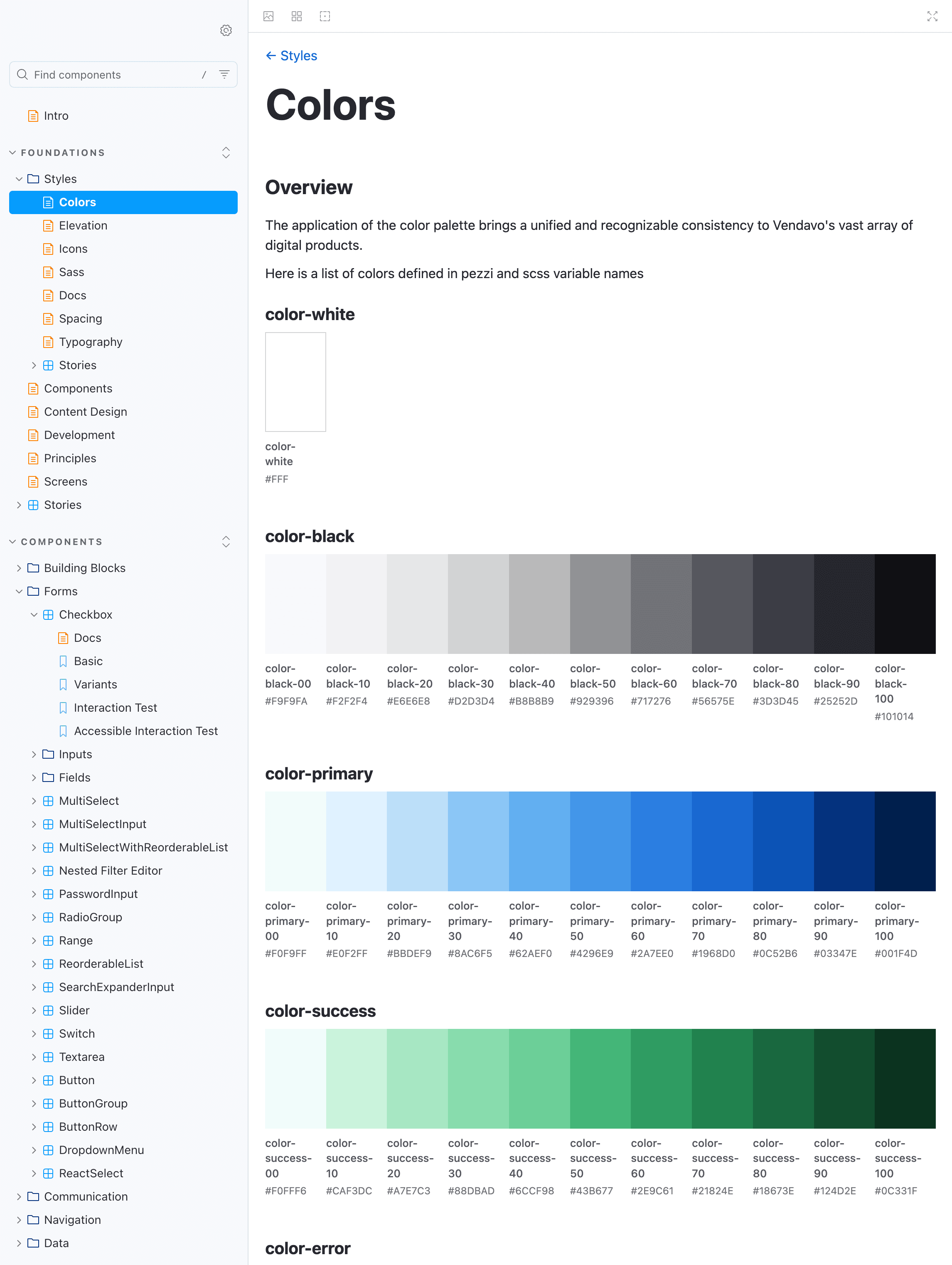
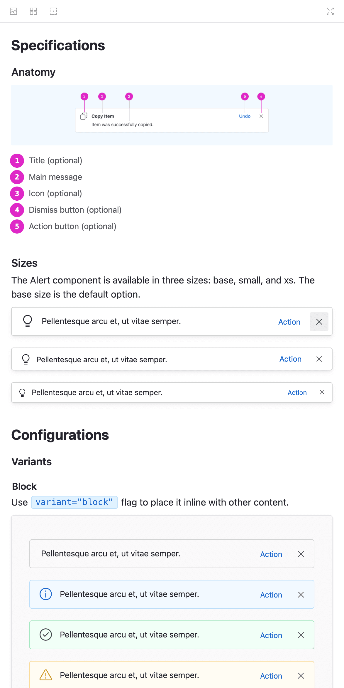
We established a design system with shared standards for colors, typography, headers, product language, and global navigation. Guided by user feedback, we folded in targeted usability upgrades, creating two-for-one wins where visual unification also removed friction in key tasks.
For integration, we provided three adoption paths. Native products consumed a styled, fully documented React component library built in partnership with Front-End Engineering. Legacy products used SASS and CSS overrides to harmonize Bootstrap, jQuery, and vanilla stacks. As the portfolio matured, we introduced Web Components so the same patterns could run across frameworks, improving scalability and reducing rework.
What changed for product teams & front end developers
Single Source of Truth
Visual tokens + components with documented variations and coded snippets.
Framework-agnostic delivery
Web Components enabled shared UX across React and legacy stacks without wholesale rewrites. (Trade-offs documented—Shadow DOM, styling, testing.)
Clear shipment slices
Teams implemented harmonization in small, prioritized chunks (headers → tables → filters), aligned to each squad’s release cadence.
Feedback loops
SMEs + real users reviewed hero-task prototypes; we iterated until patterns were clear and adopted. 84 real end-user research engagements to inform harmonization & patterns.
Results
Front-End Tech Debt Cut: Removed 55k lines for a leaner, faster stack.
Sales & market credibility: Consistent cross-product flows improved demo confidence and platform perception.
Operating leverage: A reusable harmonization playbook + component strategy scaled across legacy and new products.
Sustained adoption: Governance, docs, and extension guidance reduced “special-case” drift.
Reinforced UX’s strategic role across the company
My Roles
" width="28px"><path d="M 13.457 11.262 C 14.062 11.527 14.587 11.916 14.903 12.549 C 15.367 13.481 15.015 14.262 14.032 14.493 C 13.718 14.566 13.403 14.563 12.968 14.564 C 12.29 14.52 11.495 14.459 10.699 14.417 C 9.621 14.363 8.546 14.456 7.472 14.522 C 6.89 14.557 6.309 14.619 5.732 14.48 C 4.81 14.259 4.466 13.502 4.879 12.609 C 5.189 11.939 5.734 11.533 6.365 11.257 C 8.726 10.23 11.096 10.232 13.456 11.262 Z M 6.769 1.913 C 6.769 2.97 5.254 3.827 3.385 3.827 C 1.515 3.827 0 2.97 0 1.913 C 0 0.857 1.515 0 3.385 0 C 5.254 0 6.769 0.857 6.769 1.913 Z M 9.466 8.771 C 7.844 8.565 7.148 7.571 7.616 6.098 C 7.872 5.289 8.298 4.554 8.865 3.901 C 9.51 3.158 10.318 3.163 10.963 3.911 C 11.526 4.566 11.954 5.3 12.207 6.11 C 12.677 7.615 11.872 8.68 10.201 8.785 C 10.11 8.791 10.017 8.785 9.925 8.785 L 9.925 8.796 C 9.771 8.788 9.618 8.791 9.466 8.771 Z M 19.811 1.913 C 19.811 2.97 18.296 3.827 16.427 3.827 C 14.558 3.827 13.043 2.97 13.043 1.913 C 13.043 0.857 14.558 0 16.427 0 C 18.296 0 19.811 0.857 19.811 1.913 Z" fill="rgb(0, 0, 0)" height="14.566820566657924px" id="mYZ7GUc8N" transform="translate(4.09 18.273)" width="19.81143415023638px"/><path d="M 27.488 10.84 C 28.558 15.442 27.767 20.236 26.787 24.779 C 25.887 28.947 24.391 33.044 21.346 36.028 C 19.722 37.621 17.795 38.635 15.609 38.901 C 11.633 39.386 8.253 38.103 5.607 34.868 C 3.226 31.955 2.026 28.346 1.218 24.668 C 0.336 20.652 -0.403 16.344 0.248 12.233 C 0.795 8.771 2.345 5.403 4.969 3.143 C 7.583 0.89 10.778 -0.04 14.121 0.005 C 20.663 -0.181 26.019 4.522 27.488 10.84 Z M 18.924 5.344 C 18.894 5.438 18.919 5.542 18.987 5.611 L 19.685 6.321 L 19.52 7.323 C 19.505 7.42 19.543 7.519 19.619 7.577 C 19.696 7.635 19.798 7.643 19.882 7.597 L 20.744 7.124 L 21.606 7.597 C 21.642 7.616 21.682 7.627 21.722 7.627 C 21.775 7.626 21.826 7.609 21.869 7.577 C 21.945 7.518 21.983 7.42 21.968 7.323 L 21.803 6.321 L 22.501 5.611 C 22.569 5.541 22.594 5.438 22.564 5.344 C 22.535 5.25 22.456 5.181 22.363 5.167 L 21.399 5.021 L 20.967 4.109 C 20.925 4.019 20.838 3.964 20.744 3.964 C 20.649 3.963 20.562 4.02 20.521 4.109 L 20.089 5.021 L 19.125 5.167 C 19.031 5.181 18.953 5.25 18.924 5.344 Z M 10.54 7.327 C 10.484 7.506 10.53 7.703 10.66 7.834 L 11.987 9.184 L 11.673 11.089 C 11.642 11.274 11.715 11.462 11.861 11.572 C 12.007 11.683 12.201 11.698 12.36 11.61 L 14 10.711 L 15.639 11.61 C 15.709 11.648 15.784 11.666 15.86 11.666 C 15.96 11.667 16.057 11.634 16.138 11.572 C 16.284 11.462 16.357 11.274 16.326 11.089 L 16.013 9.184 L 17.34 7.834 C 17.469 7.703 17.516 7.506 17.46 7.327 C 17.404 7.148 17.255 7.018 17.077 6.991 L 15.244 6.713 L 14.424 4.98 C 14.345 4.811 14.18 4.704 13.999 4.704 C 13.819 4.704 13.655 4.811 13.575 4.98 L 12.755 6.713 L 10.922 6.991 C 10.744 7.018 10.596 7.148 10.54 7.327 Z M 5.437 5.344 C 5.407 5.438 5.432 5.542 5.5 5.611 L 6.198 6.321 L 6.033 7.323 C 6.018 7.42 6.056 7.519 6.132 7.577 C 6.209 7.635 6.311 7.643 6.395 7.597 L 7.257 7.124 L 8.119 7.597 C 8.155 7.616 8.195 7.627 8.235 7.627 C 8.288 7.626 8.339 7.609 8.382 7.577 C 8.458 7.518 8.496 7.42 8.481 7.323 L 8.316 6.321 L 9.014 5.611 C 9.082 5.541 9.107 5.438 9.077 5.344 C 9.048 5.25 8.969 5.181 8.875 5.167 L 7.912 5.021 L 7.48 4.109 C 7.438 4.019 7.351 3.964 7.257 3.964 C 7.162 3.963 7.075 4.02 7.034 4.109 L 6.602 5.021 L 5.638 5.167 C 5.544 5.181 5.466 5.25 5.437 5.344 Z M 19.272 24.701 C 24.029 24.701 26.478 21.708 26.478 17.108 C 26.478 12.507 24.099 9.075 24.099 9.075 C 24.308 18.348 17.941 12.507 17.941 12.507 C 16.346 18.4 14.481 18.337 14.048 18.233 L 14.046 18.203 C 14.031 18.209 14.016 18.215 14 18.22 C 13.97 18.211 13.953 18.203 13.953 18.203 L 13.952 18.233 C 13.519 18.337 11.654 18.4 10.057 12.507 C 10.057 12.507 3.691 18.348 3.901 9.075 C 3.901 9.075 1.522 12.507 1.522 17.108 C 1.522 21.707 3.971 24.701 8.729 24.701 C 8.729 24.701 6.84 26.6 8.449 28.791 C 8.449 28.791 6.07 29.229 6.07 31.273 C 6.07 33.196 8.052 35.117 13.464 35.339 L 13.464 35.362 C 13.65 35.362 13.821 35.354 14 35.351 C 14.18 35.354 14.351 35.362 14.537 35.362 L 14.536 35.339 C 19.948 35.117 21.929 33.196 21.929 31.273 C 21.929 29.229 19.55 28.791 19.55 28.791 C 21.16 26.6 19.271 24.701 19.271 24.701 Z" fill="rgb(0, 0, 0)" height="39px" id="AvwOnvTpS" transform="translate(0 0)" width="28px"/></g></svg>)
Turned an ELT mandate into a multi-quarter, cross-product program
" width="28px"><path d="M 6.769 14.401 C 6.769 15.458 5.254 16.315 3.385 16.315 C 1.515 16.315 0 15.458 0 14.401 C 0 13.345 1.515 12.488 3.385 12.488 C 5.254 12.488 6.769 13.345 6.769 14.401 Z M 12.646 0.953 C 12.646 1.479 12.237 1.906 11.733 1.906 C 11.229 1.906 10.82 1.479 10.82 0.953 C 10.82 0.427 11.229 0 11.733 0 C 12.237 0 12.646 0.427 12.646 0.953 Z M 8.993 0.953 C 8.993 1.479 8.584 1.906 8.08 1.906 C 7.575 1.906 7.166 1.479 7.166 0.953 C 7.166 0.427 7.575 0 8.08 0 C 8.584 0 8.993 0.427 8.993 0.953 Z M 9.465 21.258 C 7.843 21.053 7.148 20.059 7.615 18.585 C 7.871 17.777 8.298 17.041 8.864 16.389 C 9.51 15.646 10.318 15.65 10.963 16.399 C 11.526 17.053 11.953 17.788 12.206 18.597 C 12.677 20.102 11.871 21.168 10.2 21.273 C 10.109 21.279 10.016 21.273 9.924 21.273 L 9.924 21.284 C 9.771 21.275 9.617 21.278 9.465 21.258 Z M 14.887 25.752 C 14.887 26.307 12.657 26.756 9.906 26.756 C 7.155 26.756 4.924 26.307 4.924 25.752 C 4.924 25.197 7.155 24.748 9.906 24.748 C 12.657 24.748 14.887 25.197 14.887 25.752 Z M 8.993 3.24 C 8.993 2.837 9.592 2.161 9.776 1.964 C 9.776 1.963 9.778 1.962 9.778 1.961 C 9.779 1.96 9.779 1.96 9.78 1.96 C 9.788 1.952 9.797 1.948 9.806 1.942 C 9.817 1.934 9.827 1.926 9.838 1.921 C 9.85 1.916 9.863 1.915 9.875 1.913 C 9.886 1.911 9.896 1.908 9.907 1.908 C 9.918 1.908 9.928 1.911 9.939 1.913 C 9.951 1.915 9.964 1.916 9.976 1.922 C 9.987 1.926 9.997 1.935 10.007 1.942 C 10.016 1.948 10.025 1.952 10.034 1.96 C 10.035 1.961 10.035 1.962 10.035 1.962 C 10.036 1.963 10.037 1.963 10.038 1.964 C 10.222 2.162 10.821 2.837 10.821 3.241 C 10.82 3.62 10.635 3.812 10.272 3.812 C 10.141 3.812 10.009 3.761 9.906 3.668 C 9.804 3.761 9.671 3.812 9.541 3.812 C 9.178 3.812 8.993 3.62 8.993 3.24 Z" fill="rgb(0, 0, 0)" height="26.756076781990014px" id="XcTjlvMzX" transform="translate(4.105 5.789)" width="14.887327102304937px"/><path d="M 27.489 10.84 C 28.558 15.441 27.767 20.236 26.787 24.779 C 25.887 28.947 24.391 33.044 21.347 36.029 C 19.723 37.621 17.796 38.635 15.609 38.901 C 11.633 39.386 8.253 38.104 5.607 34.868 C 3.226 31.956 2.026 28.346 1.218 24.668 C 0.336 20.651 -0.403 16.344 0.248 12.234 C 0.795 8.771 2.346 5.404 4.968 3.143 C 7.583 0.89 10.779 -0.04 14.121 0.005 C 20.663 -0.18 26.019 4.523 27.488 10.841 Z M 10.164 6.322 C 10.156 7.243 10.458 8.145 11.01 8.863 C 11.171 9.071 11.26 9.325 11.26 9.579 L 11.26 9.978 C 11.26 9.986 11.263 9.994 11.264 10.003 C 11.266 10.017 11.268 10.031 11.273 10.044 C 11.277 10.057 11.284 10.067 11.291 10.078 C 11.296 10.086 11.298 10.095 11.304 10.103 C 11.341 10.146 11.358 10.25 11.376 10.35 C 11.414 10.567 11.464 10.863 11.77 10.985 C 11.913 11.041 12.05 10.961 12.183 10.882 C 12.247 10.843 12.369 10.762 12.393 10.774 C 12.416 10.79 12.463 10.862 12.495 10.91 C 12.587 11.051 12.702 11.226 12.892 11.249 C 13.051 11.269 13.178 11.152 13.293 11.048 C 13.342 11.004 13.433 10.921 13.451 10.913 C 13.477 10.926 13.542 10.998 13.58 11.042 C 13.686 11.162 13.819 11.312 13.999 11.312 C 14.179 11.312 14.311 11.162 14.418 11.041 C 14.455 10.998 14.52 10.925 14.529 10.916 C 14.564 10.921 14.656 11.003 14.704 11.048 C 14.819 11.151 14.95 11.27 15.106 11.249 C 15.296 11.225 15.411 11.05 15.503 10.91 C 15.536 10.862 15.584 10.789 15.589 10.781 C 15.638 10.773 15.749 10.84 15.818 10.881 C 15.95 10.96 16.088 11.04 16.23 10.984 C 16.535 10.863 16.586 10.566 16.622 10.35 C 16.64 10.249 16.657 10.145 16.693 10.103 C 16.699 10.096 16.701 10.088 16.706 10.08 C 16.713 10.068 16.721 10.057 16.726 10.044 C 16.73 10.031 16.731 10.018 16.733 10.005 C 16.735 9.996 16.739 9.987 16.739 9.977 L 16.739 9.6 C 16.739 9.333 16.831 9.068 16.995 8.853 C 17.544 8.137 17.835 7.272 17.835 6.355 C 17.836 5.263 17.422 4.243 16.67 3.482 C 15.92 2.722 14.927 2.329 13.881 2.354 C 11.849 2.419 10.181 4.198 10.164 6.322 Z M 19.271 24.702 C 24.028 24.702 26.477 21.708 26.477 17.108 C 26.477 12.508 24.098 9.076 24.098 9.076 C 24.308 18.349 17.941 12.508 17.941 12.508 C 16.345 18.401 14.48 18.338 14.047 18.233 L 14.046 18.203 C 14.046 18.203 14.029 18.211 13.999 18.22 C 13.97 18.211 13.953 18.203 13.953 18.203 L 13.951 18.233 C 13.518 18.338 11.653 18.401 10.057 12.508 C 10.057 12.508 3.69 18.349 3.901 9.076 C 3.901 9.076 1.522 12.508 1.522 17.108 C 1.522 21.708 3.971 24.702 8.728 24.702 C 8.728 24.702 6.839 26.6 8.448 28.791 C 8.448 28.791 6.07 29.229 6.07 31.274 C 6.07 33.196 8.05 35.117 13.463 35.34 L 13.463 35.362 C 13.649 35.362 13.82 35.354 13.999 35.352 C 14.179 35.354 14.35 35.362 14.536 35.362 L 14.535 35.34 C 19.947 35.117 21.929 33.196 21.929 31.274 C 21.929 29.229 19.55 28.791 19.55 28.791 C 21.16 26.6 19.271 24.702 19.271 24.702 Z" fill="rgb(0, 0, 0)" height="39px" id="TIpvvBnRn" transform="translate(0 0)" width="28px"/><path d="M 6.768 1.913 C 6.768 2.97 5.253 3.827 3.384 3.827 C 1.515 3.827 0 2.97 0 1.913 C 0 0.857 1.515 0 3.384 0 C 5.253 0 6.768 0.857 6.768 1.913 Z" fill="rgb(0, 0, 0)" height="3.8266582785753656px" id="O0CjSmNW4" transform="translate(17.137 18.278)" width="6.76847470621891px"/></g></svg>)
Evolved the component strategy to framework-agnostic approach
" width="28px"><path d="M 6.941 2.466 C 6.941 0.844 5.387 0 3.47 0 C 1.554 0 0 0.266 0 2.466 C 0 4.665 1.554 4.932 3.47 4.932 C 5.387 4.932 6.941 4.577 6.941 2.466 Z M 7.192 12.09 C 7.99 12.282 8.592 12.341 8.963 12.357 C 9 12.359 9.068 12.362 9.163 12.361 C 9.229 12.362 9.296 12.361 9.362 12.357 C 9.734 12.341 10.335 12.282 11.134 12.09 C 13.013 11.486 12.109 9.298 11.241 7.978 C 10.373 6.657 9.723 6.733 9.723 6.733 C 9.085 6.582 8.603 6.733 8.603 6.733 C 8.603 6.733 7.952 6.657 7.084 7.978 C 6.216 9.298 5.313 11.486 7.192 12.09 Z M 12.713 15.417 C 10.353 14.387 7.983 14.386 5.622 15.413 C 4.991 15.689 4.446 16.094 4.136 16.765 C 3.723 17.657 4.067 18.414 4.989 18.635 C 5.566 18.774 6.147 18.712 6.729 18.677 C 7.803 18.611 8.878 18.518 9.955 18.572 C 10.752 18.614 11.547 18.675 12.225 18.719 C 12.66 18.718 12.975 18.721 13.289 18.648 C 14.272 18.417 14.624 17.636 14.16 16.704 C 13.844 16.071 13.319 15.682 12.713 15.417 Z" fill="rgb(0, 0, 0)" height="18.721744308195692px" id="Bbe9jSpqs" transform="translate(4.838 13.822)" width="14.36226973967337px"/><path d="M 27.489 10.843 C 28.558 15.444 27.767 20.238 26.787 24.78 C 25.887 28.948 24.391 33.044 21.346 36.029 C 19.722 37.621 17.795 38.635 15.609 38.901 C 11.633 39.386 8.253 38.104 5.607 34.868 C 3.226 31.956 2.026 28.347 1.218 24.669 C 0.336 20.653 -0.403 16.347 0.248 12.236 C 0.795 8.774 2.346 5.407 4.969 3.147 C 7.583 0.894 10.779 -0.036 14.121 0.009 C 20.661 -0.237 26.019 4.526 27.488 10.844 Z M 11.358 7.871 C 11.323 7.945 11.327 8.033 11.369 8.104 C 11.411 8.174 11.484 8.217 11.564 8.218 L 14.317 8.24 L 14.003 12.345 C 13.994 12.464 14.07 12.571 14.181 12.598 C 14.292 12.625 14.406 12.563 14.447 12.452 L 16.649 6.61 C 16.677 6.537 16.669 6.455 16.627 6.389 C 16.585 6.324 16.515 6.284 16.44 6.282 L 14.021 6.228 L 14.51 2.299 C 14.525 2.182 14.456 2.072 14.349 2.038 C 14.238 2.003 14.125 2.056 14.075 2.161 L 11.358 7.871 Z M 24.913 18.899 C 25.963 13.122 24.459 7.316 24.459 7.316 C 22.698 13.951 16.907 11.996 16.907 11.996 C 16.907 13.811 15.133 14.359 13.999 14.359 C 12.865 14.359 11.092 13.811 11.092 11.996 C 11.092 11.996 5.3 13.952 3.54 7.316 C 3.54 7.316 2.035 13.122 3.085 18.899 C 3.085 18.899 3.54 22.068 8.763 22.364 C 8.763 22.364 6.947 24.26 8.423 26.748 C 8.423 26.748 6.833 27.519 6.833 30.362 C 6.833 33.187 9.467 35.321 13.955 35.361 L 13.955 35.362 C 13.971 35.362 13.985 35.362 13.999 35.361 C 14.015 35.362 14.029 35.362 14.044 35.362 L 14.044 35.361 C 18.531 35.32 21.166 33.187 21.166 30.362 C 21.166 27.519 19.576 26.748 19.576 26.748 C 21.052 24.26 19.235 22.364 19.235 22.364 C 24.459 22.068 24.913 18.899 24.913 18.899 Z" fill="rgb(0, 0, 0)" height="39px" id="OHhujOceN" transform="translate(0 0)" width="28px"/><path d="M 3.471 0 C 1.554 0 0 0.844 0 2.466 C 0 4.577 1.554 4.932 3.471 4.932 C 5.387 4.932 6.941 4.665 6.941 2.466 C 6.941 0.266 5.387 0 3.471 0 Z" fill="rgb(0, 0, 0)" height="4.932070318473592px" id="WA3dSodjb" transform="translate(16.231 13.814)" width="6.941178710851261px"/></g></svg>)
Converted audits & usage signals into “best-of” patterns
— Former Chief People Officer